The process · three directions
The original three concepts.
Before we built the site, we designed three complete directions for Anchor Studios: same brand, three structures. Open each to explore it end to end. The direction the studio chose, Concept 3 (Gallery Statement), became the live site.
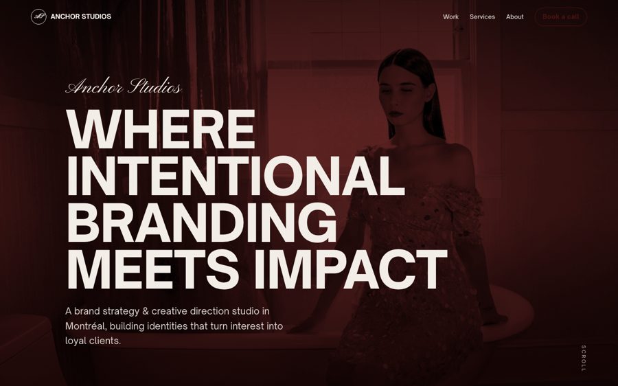
Magazine-style single scroll. Full-bleed imagery alternating with big type-only statements and lots of air. Closest to the studio’s Instagram.
View concept →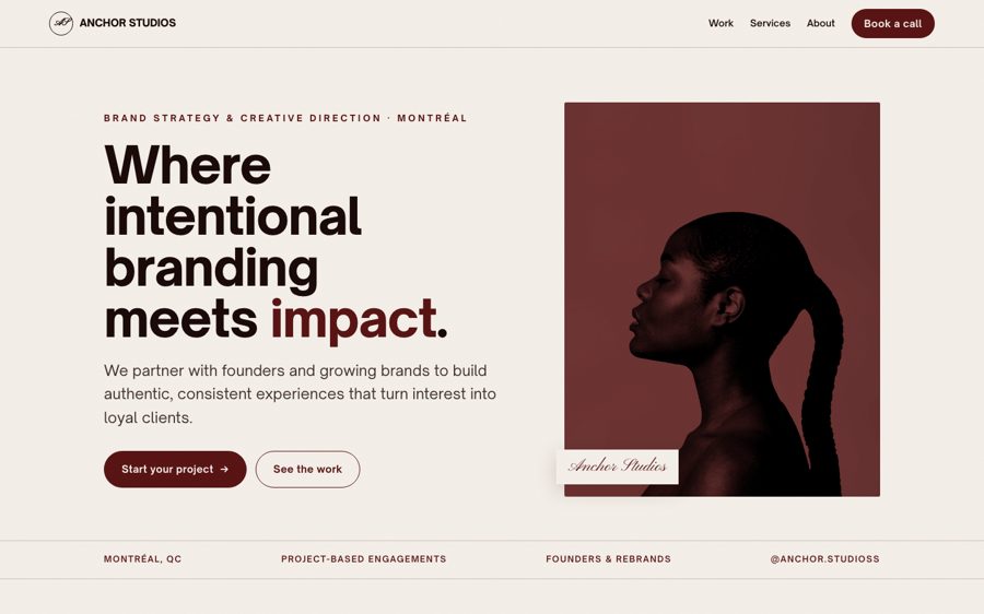
A structured studio site. Clear navigation, a work grid, and the four services as outlined cards, the most “established agency” feel.
View concept →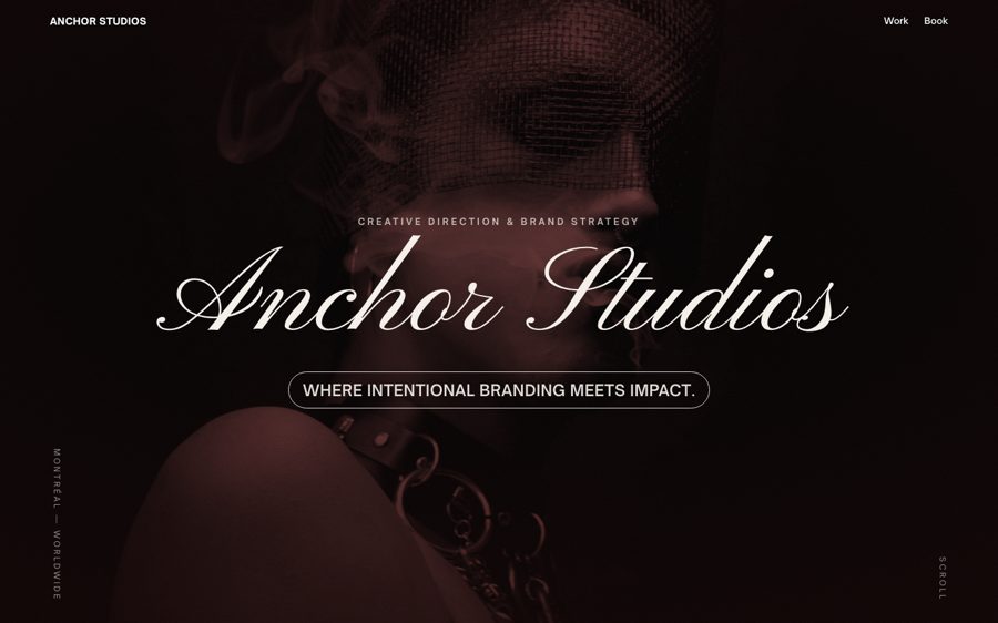
Dark and image-led. The work is the hero, framed by the script wordmark and minimal text. The boldest, most fashion-forward take.
View concept →One brand, three structures
The identity is fixed by the brand: oxblood and cream, the same wordmark and duotone photography. The concepts differ in architecture, from editorial scroll to structured studio index to gallery statement.
Illustrative imagery
Photography here is illustrative stock, treated in the brand’s oxblood duotone to stand in for a real shoot. Testimonials and pricing are sample copy; the studio’s positioning is drawn from Anchor’s own brand.
The outcome
Concept 3, Gallery Statement, became the live Anchor Studios site, with the strongest sections from the other two folded in.